09 / Ecommerce
Lola Olivia
Gender-affirming garments sold from a stock template. Rebuilt so the store sounds like its founder and reads like somewhere you are welcome.
Summary
Lola Olivia makes binders and compression garments for the LGBTQIA+ community, and a lot of its customers are young. The brand's appeal is its founder's voice: warm, direct, a little handmade, the opposite of clinical. The store did not sound like her. It ran a stock theme with an empty H1, nine navigation items, six separate sizing pages, and the brand's actual promise, gender-affirming garments for everyone, sitting in small type near the bottom of the hero. I audited the live site, set the direction for a rebuild around her own voice and materials, and reviewed every round through launch.
Context
For a lot of people, buying a binder is not a clothing purchase. It is a step toward being seen the way you already see yourself, and it is often taken quietly, by someone young, without telling anyone. The store they land on is doing more than selling. It is either a place where that feels ordinary and safe, or a place where it feels like being inspected. The old store did not fail dramatically. It failed quietly. Sizing lived across six near-duplicate pages, and the charts were screenshots, so the numbers could not be read by a screen reader, found by a search engine, or zoomed on a phone without going soft. The navigation said Compression Tops, the collection said Binders, the product said Binder, and the sizing page said compression top. The line that says who this is for sat at the bottom of the hero in small caps. None of it was broken. All of it was friction, and friction is expensive when someone is already nervous.
What I built
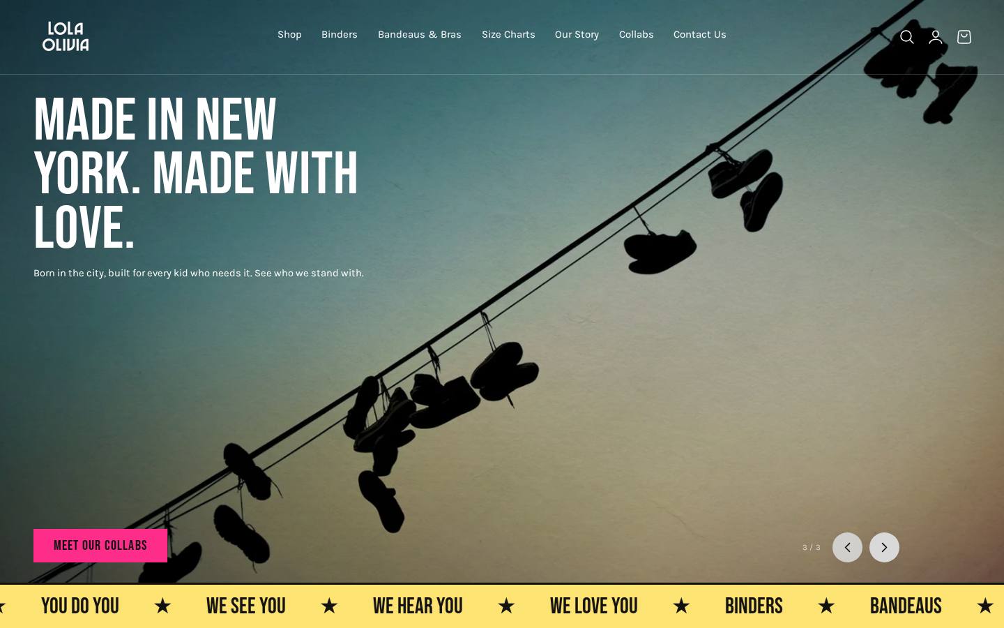
- A brand layer taken from the founder's own reference material: Bebas Neue, Karla and Caveat, an ink and cream palette with hot pink and yellow, and a kit of tape, torn paper, polaroids, stickers and a running marquee, so the store reads like a poster board rather than a template
- Custom sections built for that language rather than fitted to a stock theme: a marquee, a review wall, a mission block, a founder note, a feature collage, chaptered story pages, a measure guide, a size callout and a color lineup
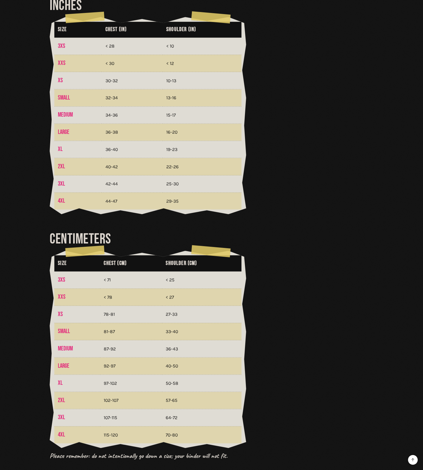
- One sizing page, replacing six near-duplicates, with the charts retyped from screenshots into real HTML tables and a 3XS row added
- Vocabulary unified to one word. Compression Top became Binder across navigation, product copy, product types and the sizing page
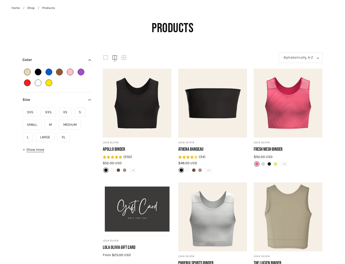
- Real collections behind the navigation, so Bandeaus and Bras point at collections instead of jumping straight into a single product
- A hero that says who the store is for: a real H1, gender-affirming garments for everyone moved into the headline instead of a caption, and a button straight to the binders
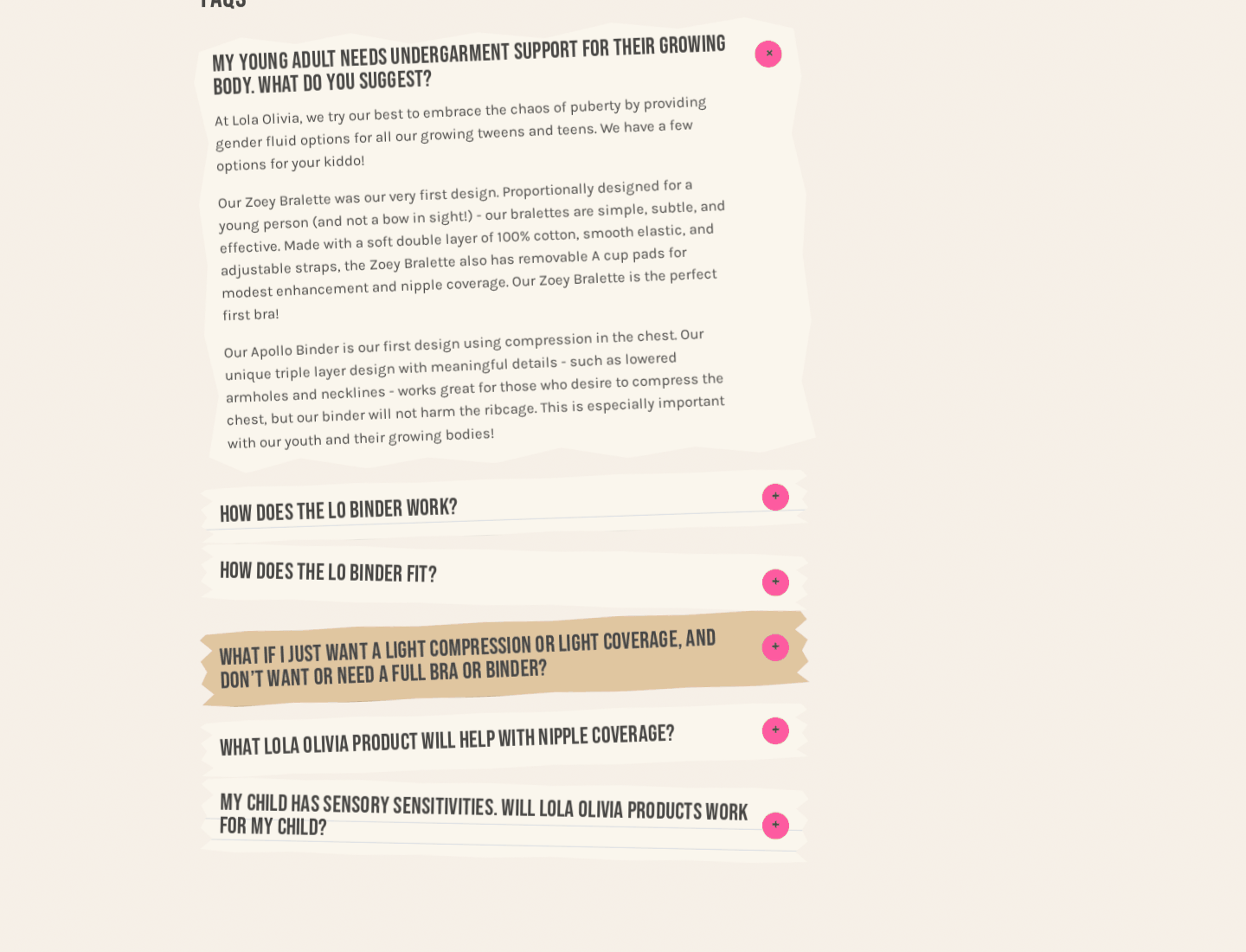
- FAQ schema on the rebuilt FAQ page, and breadcrumbs on collection pages
- Copy reviewed line by line for tone, landing on the community's own language, with the founder making every call on her own words
- A phone pass on every page, with handwriting, captions and buttons set to wrap instead of running off the screen, and image focal points set so photographs crop around their subject rather than their center
- The marquee slowed to half speed when the visitor's system asks for reduced motion, rather than stopped or left running
Screens
How it works
01
Audit
Read the live store the way a customer and a crawler each would. Titles, structure, sizing, images, scripts, and the first 1,650 pixels.
02
Direction
Pull the brand out of the founder's own material rather than inventing one. Her words stay verbatim, anything new gets flagged back to her.
03
Rebuild
Custom sections in that language, on a copy of the theme, so the live store keeps running while the new one is built beside it.
04
Structure
One sizing page, real tables, one vocabulary, real collections, schema and breadcrumbs.
05
Launch
Publish, check every internal link, confirm every page answers, keep the old theme as a one-click rollback.
Detail
A screenshot is not a size chart
The sizing data was the most important content on the store and the least available. It lived in PNG screenshots spread across six pages, which means a screen reader finds nothing, a search engine finds nothing, and a phone gives you a blurry image you cannot zoom cleanly. Someone looking for their size had to find the right page out of six, then squint at a picture of a table. Getting that right matters more here than it would on a T-shirt, because fit is the whole product. So the charts were retyped as real HTML tables on one page, a 3XS row was added, and the instruction changed. It used to read Be honest, which lands as an accusation when someone is holding a tape measure around their own chest and hoping for a particular number. It now reads: measure snug, not tight. Your number is perfect.
Outcome
The store sounds like its founder now, which for a brand this size is most of the differentiation there is, and it says who it is for in the headline rather than the footnotes. The sizing information can be read by a screen reader, found by a search engine, and zoomed on a phone, and it says one thing in one place instead of six. The vocabulary matches itself. Someone arriving nervous meets a page built with them in mind rather than a theme built for anyone. The old theme stays published as a draft, so the rollback is one click.
What I would highlight
The visual rebuild is the part people notice. The part I would point at is the sizing page. A store whose customers depend on fit had locked its fitting information inside images, and nobody had caught it, because it looked fine. Fixing it took no cleverness. It took reading the store as someone who needed something from it, and who might be nervous asking.
My role
I audited the live store, set the design direction, made the calls, and reviewed every round through launch. The founder supplied her voice, her photographs and her approvals. Her copy is the baseline, and anything new was flagged back to her before it shipped, because on a brand like this the words are the trust.
Stack
- Shopify
- Liquid
- Custom theme sections
- CSS
- JSON-LD